It doesn’t take more than about 15 minutes of being here at the IAPP to realize we have a (somewhat un)healthy obsession with George Orwell’s Nineteen Eighty-Four (1984). Throughout our offices, you’ll see a vintage movie poster featuring John Hurt and Suzanna Hamilton locked in anguished embrace under the glaring eyes of Bob Flag (Big Brother). “BIG BROTHER IS WATCHING YOU” greets you at the bottom of a stairwell. A four-foot tall big brother head surveills the marketing, sales and training teams from a perch on high. Off-putting? No, you just have to get used to it, that’s all.
Regardless of whether or not you find today’s world governments strikingly similar to Orwell’s imagined Oceania—or, at times, worse—it’s impossible to argue the book isn’t intricately linked with “privacy” at this point. As “the world’s largest privacy organization,” we can’t help but be caught up.
Recently, we came across a Brit with an equally healthy 1984 obsession who had amassed an impressive collection of various editions of the book, movie and theatre ephemera, even the aforementioned giant head—which once played the part of big brother in a theatrical production. David Dunnico, a photographer, writer and cyclist, has shown his collection of 1984 and CCTV ephemera in the UK, and when the IAPP learned of it we knew we wanted to share it with a wider audience.

So, we bought it. And we’ll present the collection to the privacy community for the first time to help open the 37th International Data Protection and Privacy Commissioners Conference on October 27 in Amsterdam.
There are literally hundreds of cover designs for 1984; the book has been translated into dozens of languages and the IAPP now has more than 100 of these editions. I’ll admit, I’m an avid reader, and an art lover who more than once has chosen a book based on the cover design alone, but until digging into this project it never occurred to me what the design of a book—particularly a classic like this one, redesigned over the years—can say about a specific culture at a specific moment in time: the trends, the use of symbolism, current events—in this case, the advancement of technology. It can truly be viewed as a recording of history.
The first editions (published in 1949) are relatively mundane, not my favorites, but who doesn’t love an original? The first UK edition is a deep mossy green, “Nineteen Eighty-Four” is written in large cursive font taking up most of the cover, the number a strong watermark behind. No imagery at all. And the first U.S. edition is beige with a torn piece of paper bearing the title. Over the past 66 years, however, eras and cultures have placed their stamp on the book—big brother comes to look a lot like Stalin, “telescreens” become CCTV cameras, red is prevalent, even controversial artist Shepard Fairey created a design.
Eyes, rats, imposing fonts, stark industrial landscapes and a sense of desperation grace the covers of many, but they run the gamut from pulpy to elegant to downright creepy. Here are a few that break the mold, and some of my favorites:
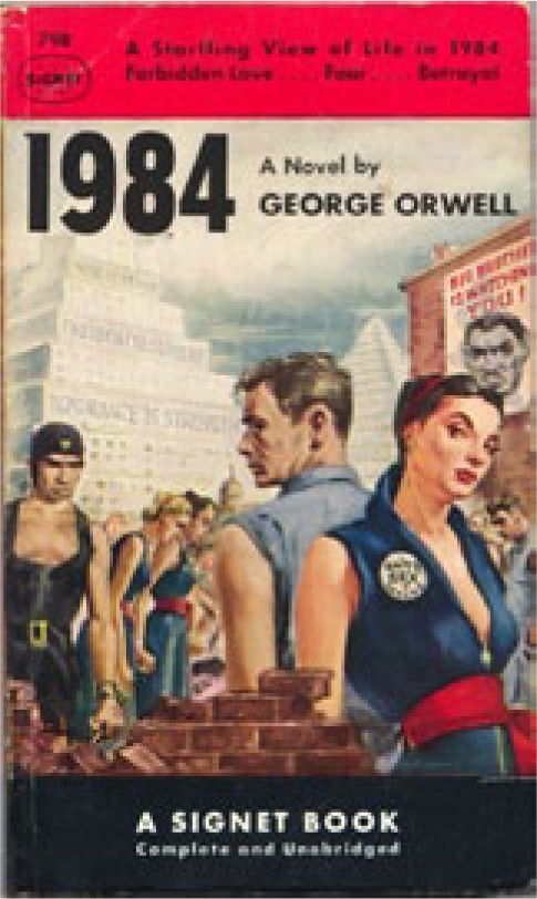
Signet, UK, 1950
Designer: Unknown
This version—with Julia as half Rosie the riveter, half 50s pinup girl – slays me. Not to mention the greaser-style cutoff sleeves on Winston’s denim shirt or the bulging pecs of the Thought Police officer glaring at them. “Forbidden Love …. Fear …. Betrayal,” it’s quintessential pulp fiction. I can just imagine June Cleaver in her crinoline skirt blushing in the book aisle of her local A&P.
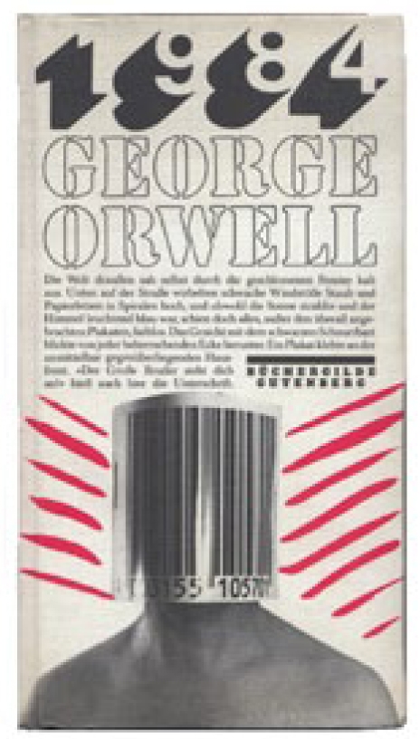
Buchergilde Gutenberg, Germany, 1984
Designer: Unknown
This symbolism pretty much punches you in the face. I don’t read German, so I have no idea what the text on the cover says, but I’m fascinated by the fact that there’s so much of it. It’s encroaching on the human, who’s been reduced to a scan-able code. There’s nothing elegant about this one; it’s cluttered and chaotic, with red lines thrown in almost just to fill up space. Everything is coming down on this man who has already lost his identity. Oh, hello, Winston.
Another cool aspect: The first and last 16 pages are red. Awesome.


1956, Librairie Galimard, France
Designer: Pierre Faucheux
At first glance this cover looks like a pedestrian lesson book, which makes its contradicting equations even more poignant. But upon closer examination, the book is covered in an elegantly textured linen and embossed with the equations. It even has an attached black satin ribbon bookmark. Then, you open it up to the words “VOUS REGARDE” and more design elements on the opening pages. In the process you get an uneasy sense of someone being able to see into your questioning mind. No wonder Faucheux is considered by some as one of the most important figures in French graphic design.
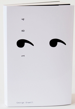
Lumen, Spain, 2014
Designer: Adronauts
This Spanish minimalist version, by Austrian designers (which somehow makes more sense to me), says so much with so little. Stark, colorless, limited—but so beautiful in its simplicity. And, of course, there are those ubiquitous watching eyes.
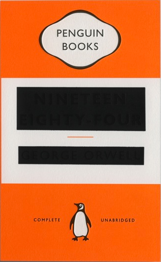
Penguin Books, 2013, UK
Designer: David Pearson
David Peason’s is my favorite by far (and I’m not alone). I wish I could hand it to you so you could feel the embossed title and author’s name on the front or turn it to see how the light catches—maybe if you get close to your screen you can see what I mean. So resourceful, this David Pearson, using all the tools of his trade to perfectly display the deep meaning of 1984. You are not important. Your words are not important. We will black you out.
Pearson told PSFK that his inspiration was “born out of altering/erasing the identity of the book,” noting that ”using classic Penguin livery–which everyone knows and understands–allowed for this sort of fun and games—I would argue that the idea wouldn’t work otherwise.”
I agree.